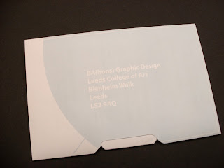
Before I started to apply any facts, statistics, information or even design, I looked at how my mail shot might work physically, simply by folding and cutting lots of paper. Essentially a lot of it comes from basic origami techniques, uncovering some rather interesting results. My aim is to design a mail shot that is both visually and physically interactive, a mail shot that doesn't immediately get dismissed with other 'junk mail' so to speak.
I decided to refrain from pursuing such an elaborate design with the envelope, I feel it is possible to achieve a design just as intriguing with a much less complex approach. After researching tobacco related products; Cigarette packets, tobacco pouches, rizla boxes etc. I came across quite a recent innovative design in B&H silver cigarette packets, opposed to using the standard flip top box for their 20decks, a push mechanism has been applied to the box introducing a completely different approach to retrieving the cigarettes.

Another modification to the standard packet I came across is pictured here, however this merely re-works the original design to a different side of the packet.

After analysing the B&H Silver packets, I decided to relay this idea to my mail shot envelope, a simple interactive element that will hopefully engage with the audience.

Initial ideas, thinking about the issues in hand regarding the cigarettes being seized etc...

Looking at representing cigarette / tobacco pouches as my mail shot. Using such wording like 'Counterfeit choice' to replace 'Cutters choice'. I do like this idea as it works with a certain level of humour but could come across too cliche and I don't think it would be able to carry off the amount of professionalism sought after.


Another idea along the same lines, using a play on brands packaging and labels to exercise the awareness of counterfeit cigarettes was to recreate the Lambert & Butler packaging with a twist in the title... 'Lombard & Butlins'. I mocked a design up in illustrator...

I could use this as the outer mail shot, with removable information inside? Or try and fit a fact or figure on each cigarette that pulls out individually. This could probably turn out to be too small and fiddly, more than likely making the audience dismiss the real point of the mail shot. And on top of that it could be seen to be a bit of a gimmick, with no real seriousness.

Still focusing on tobacco and cigarette packaging I thought back to the B&H Silver packaging that introduced a new push mechanism to their packets recently, this concept got me thinking about simple and effective ways to interact with the mail shot, recreating this push technique on a 2D level to work with paper and card.

A paper mock up of the design relating to the benson and hedges packaging. I think it has a certain suaveness about it, with the flowing curves running along the bottom of the envelope. I'm going to carry on pushing with this design, experimenting with different stock and layout design.
Using thin card, I wanted to get a real feel of how this design would work with the kind of stock I would be printing my final work on, the paper mock-ups weren't stable enough for the inside section to be pushed out using the tab at the bottom.
The card responded in a very positive way, easily allowing the inside content to be accessed with a small push. I was quite drawn to using this card for the final prints as it had a very nice finish and was almost the perfect weight and feel for the design, however the restriction of stock meant the information inside wouldn't be able to be printed on such a colour, for it to be remotely legible I needed to look at something much lighter.
Until I got closer to the final printing process, I decided to put the stocks to one side and focus on the content design. I wanted to make my design striking but not to 'in your face' as to come across too lavish and unprofessional. So proceeding with the net design of my mock up, I sketched it up in illustrator and played about with the design and layout.
The 'Smoking Kills' label, and other anti smoking messages alike are almost solely related to cigarette packets sold in our shops today. A simple play on this using the word 'counterfeit' worked really well, instantly linking the audience to the topic in hand through a widely known visual.
I thought about using the 'Counterfeit Kills' image on the outside of the envelope. As mentioned earlier, it would immediately inform the viewer of the purpose of the mail-shot, however this wasn't necessarily what I wanted to achieve.
Placing 'Counterfeit Kills' so obviously on the envelope arose a couple of issues for me, the first being a simple case of maybe interfering with the address written on the front, where legibility is key. The second is how the audience may perceive this image. Many may immediately associate it with a 'Stop smoking' campaign or feel it has little relevance and dismiss it.
I integrated very simple and definitely not scientifically correct chemical bonds into the background of the leaflet and an oversized one on the envelope to hint at the dangerous chemicals and materials used in counterfeit cigarettes.
A few pictures of the final mail shot design printed on standard matt paper, and the inside leaflet printed out in black and white. Such a weak stock didn't really represent how the final piece would work physically, but it was nice to see the design in its full form.


No comments:
Post a Comment