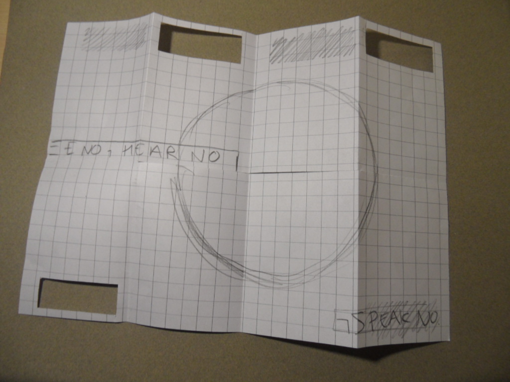
Working out where the text and lines would sit together on the poster, to work once folded..


At first I intended to print the text on the reverse of the page, to then cut it out. After taking time and printing costs into account I figured it would be more logical to print the text on the same side, simply flipping it allowing it to work once cut and folded.

Test prints of the book and how it works in true A4 format. The stock does the design no justice but I achieved a sense of composition, leaving me unsure as to weather or not to keep the blue text? I feel it clutters the design, and with 'Three Wise Monkeys' scripted in the front pages, maybe the image could work standing alone...


Rather pleased with the cut out type overlayed on magenta lines, I think it adds a more hand-made feel, especially as I'm using digital print. I want each one to feel unique.
No comments:
Post a Comment