Showing posts with label Good. Show all posts
Showing posts with label Good. Show all posts
22.11.11

21.11.11
Products
My final deliverables, the spray cans mocked up in display packaging that could be used for the promotional side of the project. Special edition boxes could be produced through collaborating with artists using the nike paint, and presented as special edition packs with cans and a custom colour guide.

I covered the cans in sticky back plastic to give them more of a gloss finish as they would look if professionally printed using a rotary litho process. The guide's content I'm pretty happy with, a full bodied colour range with an in depth product specification of the cans.


I'm pretty dissapointed I didn't get around to mocking up any packaging designs, and feel that the deliverables don't feel extremely considered or full bodied. I don't believe I put enough effort into bringing it all together in a professional manor and it shows through the pictures and final products.


I covered the cans in sticky back plastic to give them more of a gloss finish as they would look if professionally printed using a rotary litho process. The guide's content I'm pretty happy with, a full bodied colour range with an in depth product specification of the cans.


I'm pretty dissapointed I didn't get around to mocking up any packaging designs, and feel that the deliverables don't feel extremely considered or full bodied. I don't believe I put enough effort into bringing it all together in a professional manor and it shows through the pictures and final products.


Colour guide
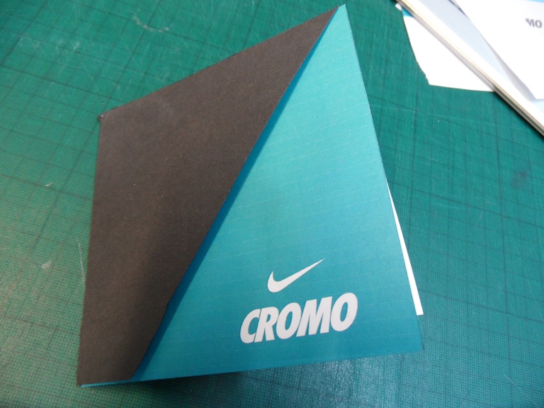
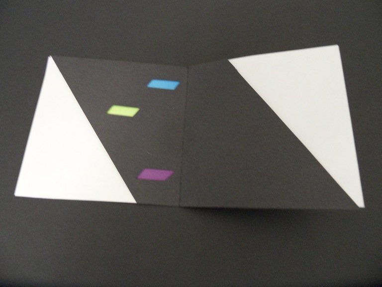
Final version of my Nike Cromo paint guide. Not exactly as I wanted it to look in terms of colour and print process but the vague idea of its presence is achieved. The two stocks I duplexed together for the insdie leaflet made the whole thing slightly thick once together and folded.


20.11.11
sleeve
Making up the final print gudie using the laminating technique to get the foil effect I would propose for the sleeve.


A few drawbacks of using the laminating technique, (although it is olnly a method of proposal) is the lack of opaqueness when using stocks with a slightly rough grain, the black didnt hold the foil too well at all. The other is a crinkling of the paper, I'm assuming it's a result of the moisture being drawn out but it doesn't achieve a very desirable effect.

From the last mock up I found that seperating the fold on one side allows the guide to fold much easier once the pulication is together. It also allows the possibilities of other foldable combinations.


The colour I ended up using was slightly darker than the blue I initially wanted to use, the reasoning behind this was the subtle quality of the fade when the colour was that bit darker. It would ideally be a spot colour, litho printed to ensure an opaque true colour.


A few drawbacks of using the laminating technique, (although it is olnly a method of proposal) is the lack of opaqueness when using stocks with a slightly rough grain, the black didnt hold the foil too well at all. The other is a crinkling of the paper, I'm assuming it's a result of the moisture being drawn out but it doesn't achieve a very desirable effect.

From the last mock up I found that seperating the fold on one side allows the guide to fold much easier once the pulication is together. It also allows the possibilities of other foldable combinations.


The colour I ended up using was slightly darker than the blue I initially wanted to use, the reasoning behind this was the subtle quality of the fade when the colour was that bit darker. It would ideally be a spot colour, litho printed to ensure an opaque true colour.


Gradient
I wanted to see how different process colours would sit on the green stocks I aquired for the main outside of the colour guide. I've been looking for a nice blue to green fade but when the ink levels have too much cyan the gradient doesnt seem to fade out as well as on screen.


18.11.11


16.11.11




Subscribe to:
Posts (Atom)