Further experiments with the word 'collide', working from one of my earlier ideas but with a considerably more technical approach to what I initially planned. Rather than the letter just bouncing around the screen and colliding together, I wanted to add a bit more complexity.
Still only a working draft, but maybe a start towards one of the resolutions to the silent movie brief. There are a few areas I'd want to tweak before even considering colour or any other elements;
∆ A more natural speed when moving around the screen, maybe speeding up slightly as they collide with the wall?
∆ Also whilst the letters are moving around the frame, instead of zooming past and through each other, it would be an idea for them to collide and go off in their separate directions until they arrange in the correct order.
∆ I feel that they move around the screen for slightly too long, an element to take back to the time line to decide how long they move until coming together.
∆ A more fluid reaction from the main body of the word when the 'e' hits it's right hand side, maybe separating quicker?
Showing posts with label Type. Show all posts
Showing posts with label Type. Show all posts
11.12.11

8.12.11
Abstraction
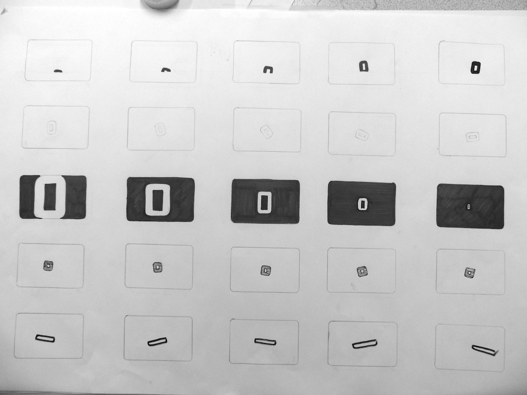
Whilst trying to make the most out of an A4 piece of paper, arranging the larger glyhps in order to fit them all on the page, I came across a potential idea to explore. Working with the word 'Collide', it got me thinking about how the glyphs could be arranged/sequenced in a more abstract way, but still eventually delivering the word collide...
 Just leaving the larger letters making up the word 'colldie' - lower and uppercase, I wouldn't say the left hand example reads extremely well, whilst the right hand side seems a bit more legible, although that could easily just be from an overload of the word in my head. I want to explore this idea mocking up some still designs, looking for abstract but still legible glyph arrangements.

 Just leaving the larger letters making up the word 'colldie' - lower and uppercase, I wouldn't say the left hand example reads extremely well, whilst the right hand side seems a bit more legible, although that could easily just be from an overload of the word in my head. I want to explore this idea mocking up some still designs, looking for abstract but still legible glyph arrangements.
6.12.11
Commence
After today's sessions from Fred and Mike, it got me really enthused to start getting myself fully immersed in a motion orientated mindset. Learning the more technical side of After Effects, although at this stage still primitive, is such an eye opener of the capabilities, its put the complexities (in both design and execution) of even the most simply appearing videos into a lot more context.
Working with the word collide and based on one of my sequences, I started experimenting with the new skills acquired from the session. It's naturally been easier to experiment with depth and perspective more expressively than hand rendering, but without the idea process before
Working with the word collide and based on one of my sequences, I started experimenting with the new skills acquired from the session. It's naturally been easier to experiment with depth and perspective more expressively than hand rendering, but without the idea process before
2.12.11


15.11.11


10.11.11
Font
As I imagined Nike aren't too keen to share their typographic assets, so I tried to replicate it as best I could, below are the 4 typefaces that came closest with a bit of tweaking here and there. Futura and Impact seem to be the closest match of the set, although the K and E are quite similar to that of League Gothic. This said, I may just manually trace the original logo to keep it as visually accurate as I can.

I will however have to use one of these typefaces for the rest of the wording, so I compared each one using other characters and words...

For me, Futura works the best here, although League Gothic works quite well and bears a resemblance to this font commonly used for Nike. I'll have to play around with each of them in context before I can make a firm judgement.


I will however have to use one of these typefaces for the rest of the wording, so I compared each one using other characters and words...

For me, Futura works the best here, although League Gothic works quite well and bears a resemblance to this font commonly used for Nike. I'll have to play around with each of them in context before I can make a firm judgement.
All-day Type
Started off the day trying to fit a block of text into a certain sized grid space in InDesign.


Filling the next columns along, each time changing the point size slightly smaller but still fitting the body of text from top to bottom on the page... I started in point size 11 and ran chronologically through to 8. When talking about a body of text you could say it's 11 on 14.5, the first number being the point size, the second being the leading.

1st Column - 11 on 12.6
2nd Column - 10 on 14.16
3rd Column - 9 on 15.4
4th Column- 8 on 17.7
*Always print out a rough black and white to assure you're working in the correct point size, relative to the size of the paper. 8 or 9 is perfect for A4 read around arms length away.*

We decided the second column was the most readable, in a new document we opened up a ten column landscape page and copied the text over, we wanted four bodies of text to cover the ten columns, over 1 column, 2 columns, 3 and 4 columns. This exercise looks at the legibility of type over different column widths...
*An average sentence length is about 14/15 words long*


*The general rule of thumb when working with a body of text, is the minimum amount of words on a line is usually 5/6, it sits comfortably and legibly. Maximum words a line is usually 11/12, a novel would typically exercise this.*
Rule of Thumb - Never decrease leading, think about manual typesetting. Always work increasing the leading, increases legibility. Change point size instead.
Experimenting with Typeface, Weight, Alignment...


Working with more than one paragraph..

Indents are used where there is a lack of differentiation between where one line ends and a new paragraph
Think about how people see the whole body of text when they initially look at it, paragraph spacing can be visual trickery to make there seem less text to read...

The Tab key is a standardly set 10mm indent, which is good for needing specifically 10mm, but the correct indent should always be relative to the point size. We indent in MM but it should be usually about the width of 3 characters.
2 isn't visually obvious as an indent. where as 4 could leave a widow between paragraphs (when the indent is bigger than the last word on the last line of the paragraph).
*NEVER AN INDENT AND A PARAGRAPH SPACE TOGETHER*

Colour of the page, a term used to refer to the tonal value of the page created by the amount of text against the white space.

Introducing an image...


*Leading should usually be 2 points larger than the point size*
Using the same image, it was our task to try and make it as large as possible on the page whilst keeping all the text bodies legible and of course filling the page.
Trying to split down the columns and place the picture bottom middle wasn't particularly successful as the text didn't fit on and the text didn't entirely flow when read.
 Switching the picture format to portrait allowed it to consume the full height of the page, still keeping ratio in tact and allowing all the text to fit on the page, moreover focusing on legibility.


ENCORPORATING WHITE SPACE...


Filling the next columns along, each time changing the point size slightly smaller but still fitting the body of text from top to bottom on the page... I started in point size 11 and ran chronologically through to 8. When talking about a body of text you could say it's 11 on 14.5, the first number being the point size, the second being the leading.

1st Column - 11 on 12.6
2nd Column - 10 on 14.16
3rd Column - 9 on 15.4
4th Column- 8 on 17.7
*Always print out a rough black and white to assure you're working in the correct point size, relative to the size of the paper. 8 or 9 is perfect for A4 read around arms length away.*

We decided the second column was the most readable, in a new document we opened up a ten column landscape page and copied the text over, we wanted four bodies of text to cover the ten columns, over 1 column, 2 columns, 3 and 4 columns. This exercise looks at the legibility of type over different column widths...
*An average sentence length is about 14/15 words long*


*The general rule of thumb when working with a body of text, is the minimum amount of words on a line is usually 5/6, it sits comfortably and legibly. Maximum words a line is usually 11/12, a novel would typically exercise this.*
Rule of Thumb - Never decrease leading, think about manual typesetting. Always work increasing the leading, increases legibility. Change point size instead.
Experimenting with Typeface, Weight, Alignment...


Working with more than one paragraph..

Indents are used where there is a lack of differentiation between where one line ends and a new paragraph
Think about how people see the whole body of text when they initially look at it, paragraph spacing can be visual trickery to make there seem less text to read...

The Tab key is a standardly set 10mm indent, which is good for needing specifically 10mm, but the correct indent should always be relative to the point size. We indent in MM but it should be usually about the width of 3 characters.
2 isn't visually obvious as an indent. where as 4 could leave a widow between paragraphs (when the indent is bigger than the last word on the last line of the paragraph).
*NEVER AN INDENT AND A PARAGRAPH SPACE TOGETHER*

Colour of the page, a term used to refer to the tonal value of the page created by the amount of text against the white space.
Introducing an image...


*Leading should usually be 2 points larger than the point size*
Using the same image, it was our task to try and make it as large as possible on the page whilst keeping all the text bodies legible and of course filling the page.
Trying to split down the columns and place the picture bottom middle wasn't particularly successful as the text didn't fit on and the text didn't entirely flow when read.


ENCORPORATING WHITE SPACE...

Subscribe to:
Posts (Atom)